Source – AutoX
With an eye-catching chrome-inspired concept, McLaren has debuted a unique outfit for the United States Grand Prix in Austin.
McLaren is set to dazzle fans at the United States Grand Prix in Austin with a stunning, one-off chrome livery that harks back to the team’s past while embracing the future. The special design will be showcased at the Circuit of the Americas (COTA), marking yet another bold visual transformation for the Woking-based squad in 2024. Known for their experimental liveries, McLaren continues to reinvent its look, and the US GP chrome makeover is the latest chapter in this evolving trend.
The chrome livery is more than just an aesthetic choice—it’s a nostalgic nod to McLaren’s earlier designs that dominated the sport in previous years. The team’s decision to bring back the chrome look has not only ignited excitement among long-time fans but also serves as a tribute to one of their key sponsors, Google. The iconic tech company’s chrome browser is cleverly integrated into the livery, blending McLaren’s rich history with a forward-looking partnership that highlights the synergy between innovation on and off the track.
Source – Formula1.com
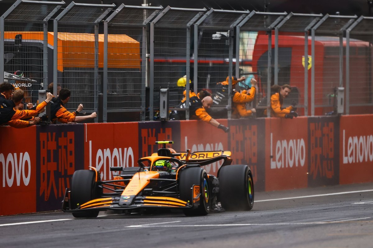
This chrome design will be the fourth time in the 2024 season that McLaren has opted for a stand-alone livery. The papaya team kicked off their season of artistic experimentation in Japan with an emoji-inspired livery that celebrated the vibrancy of modern pop culture. Then came the tribute to Ayrton Senna at Monaco, where the MCL38 donned a livery steeped in F1 history, honoring the legendary driver with a design that brought back memories of the Brazilian’s dominant days at McLaren. In Singapore, the team made another bold visual statement, with Lando Norris driving a partially white-liveried car to victory under the night sky, capturing both the race and fans’ imaginations.
The US Grand Prix’s chrome livery represents a unique fusion of McLaren’s racing heritage and their modern-day push toward technological partnerships. While Google’s influence can be seen in the gleaming chrome accents, the design itself is a subtle callback to McLaren’s chrome-heavy cars of the past, particularly during their partnership with Mercedes. That era saw McLaren secure victories and podiums, and the revival of this iconic look has stirred up memories of those glory days.
As McLaren heads to Austin, the team aims to make a statement not only in terms of performance but also with their visual impact. In recent years, McLaren has embraced its role as one of the sport’s most daring teams when it comes to liveries, and the chrome design for the US Grand Prix continues that tradition. This evolving approach to design underscores McLaren’s willingness to innovate both on and off the track, pushing the boundaries of what a Formula 1 team can represent visually. Each new livery has added a layer of personality to the team, and the chrome finish in Austin will undoubtedly be a standout moment in an already thrilling season.
Source – formula.com
With McLaren battling for key positions in both the drivers’ and constructors’ championships, the chrome livery symbolizes not just a tribute to the past, but also their ambitions for the future. The team is embracing its heritage while simultaneously pushing forward with cutting-edge technology, reflected both in their on-track performance and their partnerships with global giants like Google.
As the United States Grand Prix approaches, McLaren fans and the broader F1 community are eagerly awaiting the sight of this gleaming chrome masterpiece racing through the twists and turns of COTA. Whether it serves as a good luck charm for Lando Norris and Oscar Piastri, or simply as a nod to McLaren’s enduring legacy, one thing is certain—the papaya squad is ready to turn heads once again.

